The key to a successful interior is not following a trend, but translating your personal story into a sensory and authentic language.
- Physical sample boards surpass screens for validating a room’s actual atmosphere and its light.
- Harmony comes from thoughtful mixing (objects, patterns, eras) and not from the uniformity of furniture sets.
Recommendation: Start with a single object that has meaning for you (like a family heirloom) and build your decor around its story to guarantee an authentic foundation.
You’ve pinned hundreds of images on Pinterest. Your Instagram favorites are overflowing with sleek Scandinavian living rooms, warm rustic kitchens, and eclectic bohemian bedrooms. Yet, when you look at your own interior, you feel paralyzed. How do you assemble these snippets of inspiration into a coherent whole without it looking like a clumsy accumulation? This frustration is a symptom of a deeper problem: you are looking for a style, when you should be looking for your signature.
Classic solutions, like style quizzes or buying a complete furniture “set,” lock you into impersonal boxes. They suggest you copy a formula, not create your own. The risk is ending up with an interior that is certainly “on-trend,” but one in which you don’t recognize yourself—an empty shell that tells nothing about you. What if the real key wasn’t choosing a style, but developing a decorative language of your own? A language that speaks of your memories, your aspirations, and your history.
This article is not a catalog of trends to imitate. It’s coaching. Together, we will deconstruct the reflexes that lead to generic interiors to give you the psychological and practical tools to reveal your own aesthetic signature. We will learn how to make the old and the new dialogue, how to master colors and textures like a professional, and how to transform your space into a true reflection of your personality—an interior narrative that is unique to you.
To guide you through this introspective and creative process, we will explore the essential steps for moving from confusion to a clear and personal decor signature. This guide will show you how to build an authentic interior, far from the impersonal standards of catalogs.
Table of Contents: Defining your personal decor signature, beyond the catalogs
- Why sticking real samples on a board works better than Pinterest for validating your choices?
- How to integrate grandma’s antique dresser into a contemporary living room without it looking “dated”?
- How to apply the magic color proportion for a professional result every time?
- The mistake of doing “seaside” decor with seashells everywhere instead of subtly evoking the atmosphere
- When to stop adding knick-knacks to avoid the “junk shop” effect?
- How to mix stripes, florals, and solids without creating visual chaos on your sofa?
- The mistake of buying the complete bedroom “set” that makes decor impersonal and dated
- How to radically change your living room style for less than $150 thanks to textiles?
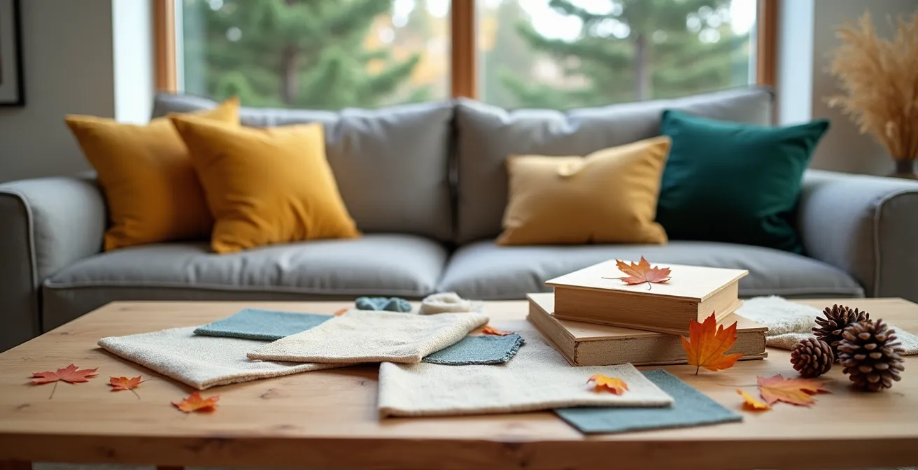
Why sticking real samples on a board works better than Pinterest for validating your choices?
Your phone screen is a liar, as beautiful as it may be. It smooths out textures, uniformizes light, and flattens nuances. Pinterest is a fantastic inspiration tool, but it’s a terrible validation tool. The true alchemy of an interior happens in the physical world, under the changing light of your own room. That’s why the physical sample board method, or tangible “moodboard,” is the most crucial step in moving from idea to reality.
Creating a physical sample board forces a beneficial digital disconnect. Instead of “swiping” endlessly, you touch. You layer a linen fabric sample over a paint color chip, next to a piece of your existing flooring. It is a sensory act. This holistic approach, which anchors the vision in the materiality of the room, allows you to create a coherent and warm atmosphere. You can thus layer textures and materials to bring warmth, while ensuring that the personal resonance of each element works in harmony with the others.
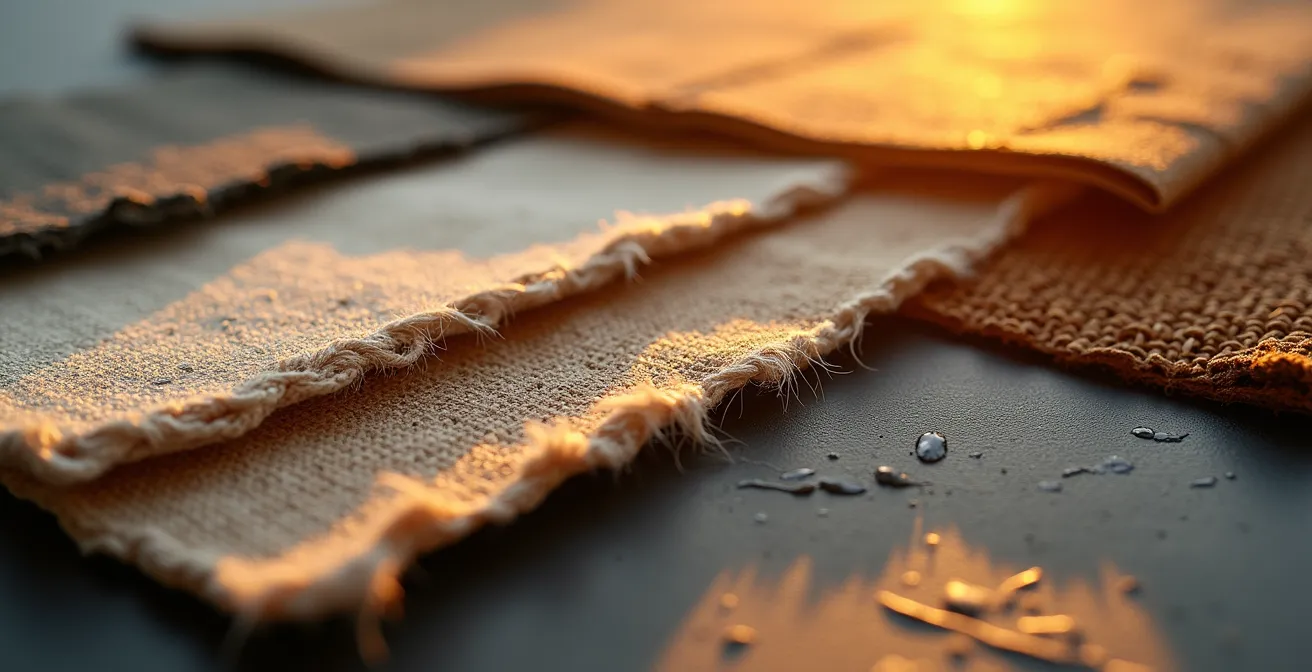
The image above perfectly illustrates this principle: the raking light reveals the grain of the wood, the weave of the linen, the softness of the velvet. This tactile and visual information is impossible to perceive on a screen. It is by observing these interactions under your living room’s light—the bright light of a Canadian summer afternoon as well as the lower, colder light of a January morning—that you will truly validate your choices and avoid costly mistakes.
Your action plan: creating the perfect sample board
- Test under local light: Observe your samples at different times of the day. The bright summer light in Canada is not the same as the colder, lower winter light, which can radically alter colors.
- Integrate the context: Stick on elements you are keeping. A color chip of the flooring, a photo of the existing sofa, or the window frame are essential to ensure coherence.
- Add the sensory dimension: Don’t just stick to colors. Include varied textures like linen, velvet, or a small piece of raw wood to validate the tactile atmosphere you’re looking for.
- Organize according to proportions: Arrange your samples respecting the 60-30-10 rule (primary color, secondary, accent) to visualize the final balance in your space.
- Live with your creation: Leave your sample board in plain sight in the room concerned for at least a week. This cohabitation is the ultimate test before making a final decision.
In short, the sample board is your bridge between the digital dream and tangible reality. It is the first step toward making your home look like you, and not just like a perfectly filtered image.
How to integrate grandma’s antique dresser into a contemporary living room without it looking “dated”?
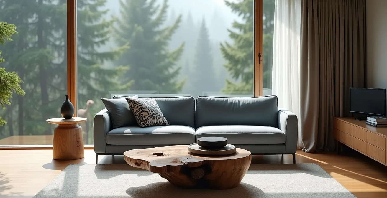
This piece of furniture is not a problem; it’s your anchor. Your grandmother’s dresser, that inherited armchair, or that flea-market table are not “dated” objects; they are carriers of history, pieces with a soul. The mistake would be trying to hide them or forcing them to blend into a decor that isn’t theirs. The key is to create a dialogue between eras. Your mission is not to camouflage the furniture, but to celebrate it by making it converse with the present.
To do this, forget the idea of “matching” styles. Instead, think in terms of contrast and echo. An antique piece placed next to a contemporary work of art by a Canadian artist, for example, creates a visual tension that enhances both pieces. One anchors the other in history, while the second projects the first into modernity. You can also use the principle of the echo: identify a unique detail of the furniture—the curve of a handle, a particular shade in the wood grain—and repeat that shape or color subtly elsewhere in the room, on a cushion, a vase, or a frame.
Sometimes, the stroke of genius consists in repurposing the furniture’s original function. That old dresser can become a spectacular designer bar, a unique vanity unit in a powder room, or a surprising storage island. Giving it a new use is giving it a new life and fully integrating it into your contemporary daily life. As one design enthusiast points out:
Choosing new legs for your old furniture will give them a second life. At the same time, it will bring a chic and designer touch to your interior decoration. It is possible to completely transform the appearance of an old dresser simply by changing the legs or applying adhesive paper in strategic places to create harmony with your modern decoration.
– Testimony on upcycling, C-Tendance
Ultimately, this family heirloom becomes the centerpiece that prevents your interior from looking like a catalog page. It is tangible proof that your home has a history, a depth that cannot be bought or mass-produced.
How to apply the magic color proportion for a professional result every time?
Color is the area where paralysis most often strikes. The fear of making a mistake pushes us toward white walls and beige sofas, creating soulless spaces. However, there is a creative safeguard used by all interior designers to create harmonious palettes: the 60-30-10 rule. It’s not a rigid law, but a proportion guide that ensures visual balance and gives you the confidence to dare with color.
The principle is simple: your palette consists of three colors. The discipline revolves around the famous 60% dominant color rule, complemented by 30% secondary color and 10% accent color.
- 60% – The dominant color: This is the backdrop of your room. it usually covers the walls, large rugs, and the sofa. It’s what sets the general tone.
- 30% – The secondary color: It is there to create interest and support the main color. It is found on curtains, side chairs, bed linen, or an accent wall.
- 10% – The accent color: These are the jewels of your room. Touches of bright or contrasting color on cushions, decorative objects, and artwork. This is where you can express your boldness.
To help you choose the right base, here is an adaptation grid for the Canadian context, which takes into account the orientation of the room and its impact on color perception. This comparative analysis is a valuable tool for refining your palette choice.
| Orientation | Dominant color (60%) | Recommended adjustment |
|---|---|---|
| North | Light warm tones | +2 shades lighter |
| South | Neutral tones | No adjustment |
| East | Soft cool tones | +1 shade lighter |
| West | Natural earth tones | -1 shade to balance |
By using this structure, you are no longer in doubt, but in strategy. You can play with colors with the assurance of a result that is always balanced and professional.
The mistake of doing “seaside” decor with seashells everywhere instead of subtly evoking the atmosphere
Wanting to recreate an atmosphere that is dear to you is an excellent intention. The trap is falling into literal translation. A “seaside” style interior filled with fishing nets and seashells doesn’t evoke the beach; it illustrates it in a caricatured way. True elegance lies in evocation, not illustration. It’s about capturing the spirit of a place, its essence, rather than collecting its clichés.
As a decoration guide points out, context is king, and subtlety is its queen. The idea is to trust the intelligence and sensitivity of the viewer.
A rustic atmosphere is well-suited to the countryside, just as a seaside style will be even more appreciated if the beach is just a few steps away.
– Ootravaux, Guide to interior decoration styles
Instead of sticking on fir tree decals for a “Laurentian cottage” style, focus on what really creates the mood: the textures of a chunky knit blanket, the palette of deep greens and snowy whites, the scent of a cedar candle. For a British Columbia “West Coast” vibe, forget tourist souvenirs and favor sculptural driftwood, a palette of misty Pacific blue-grays, and the discreet integration of a graphic pattern inspired by First Nations art. It is a tribute, not an imitation.
The secret is to break down the atmosphere into its sensory elements:
- The color palette: What are the dominant tones in the landscape that inspires you?
- Textures and materials: Raw wood, smooth stone, wrinkled linen, soft flannel?
- Light: Is it bright and direct, or filtered and diffuse?
- Sounds and smells: How do you translate the silence of the forest or the smell of salt air?
Your interior then becomes a suggestion, an invitation to travel, much more powerful and poetic than a simple postcard.
When to stop adding knick-knacks to avoid the “junk shop” effect?
There is a fine line between a personal interior and a cluttered space. You accumulate objects you like, but suddenly, the whole thing becomes visual background noise where nothing is highlighted anymore. The secret to avoiding the “junk shop” effect is not to throw everything away, but to become a ruthless curator of your own collection. Every object must earn its place by meeting a clear criterion. For this, a powerful principle is that of “visual breathing.”
This method consists of considering empty space not as a lack, but as a design element in its own right. Surrounding an object or a group of objects with an empty space equal to its own size creates a focal point. This forces your eye to land and appreciate the piece for what it is. Applying this principle forces you to make conscious choices and move from a logic of accumulation to a logic of curation. It is this selective highlighting that will make the result unique and personal.
To decide what stays and what goes, apply the three-function test to every object that doesn’t have an assigned place:
- Is it deeply useful? If it fulfills an essential and daily function, it has its place.
- Is it exceptionally beautiful? If it brings a unique aesthetic value, a visual joy at every glance, it deserves to stay.
- Does it tell a strong personal story? If it is loaded with important emotional meaning—a precious memory—it is non-negotiable.
By making room, you don’t lose objects; you gain clarity. You allow the pieces that really matter to shine and tell their story without being drowned out by the noise.
How to mix stripes, florals, and solids without creating visual chaos on your sofa?
The sofa is often the main stage of the living room, and the cushions are the actors. The temptation is great to throw everything you love onto it, but the result can quickly turn into visual cacophony. Mixing patterns like stripes, florals, and geometrics is not only possible, it’s what gives character and depth to a decor. The secret is not in restriction, but in applying a few simple harmony rules to create a visual hierarchy.
First, play with scale. For different patterns to coexist without fighting, they must have very different sizes. Pair a large dominant pattern (wide flowers, for example), a smaller and more discreet secondary pattern (fine stripes), and a third textured or very small pattern (houndstooth, a solid with a visible grain). The eye will perceive them as complementary texture levels rather than competing patterns.
Second, unify everything with a color family. This is the invisible thread that will tie your composition together. All your cushions, whether patterned or solid, must share at least one or two colors in common. Before buying, isolate this common palette. For example, if your floral cushion contains navy blue, sage green, and powder pink, make sure your striped cushion picks up that same navy blue and that your solid cushions are sage green and powder pink. This chromatic coherence is what transforms a random collection into an intentional composition. For a local touch, you can integrate a Canadian “bridge pattern,” such as a cushion featuring a design inspired by Arrow Sashes (ceintures fléchées) or NFB posters from the 70s, and use its colors as a base for choosing the other textiles.
By respecting these principles of scale and color, your sofa will no longer be a visual battlefield, but the joyful and sophisticated expression of your personality.
The mistake of buying the complete bedroom “set” that makes decor impersonal and dated
It is the ultimate easy solution. Walking into a store and buying the coordinated set: the bed, the two nightstands, the dresser. It’s fast, it’s simple, and it’s the shortest path to a soulless and quickly dated interior. A bedroom “set” is the antithesis of a personal signature. It screams “I was bought all at once” and leaves no room for evolution, history, or life.
True elegance is born from collection, from gradual assembly. An OpinionWay survey reveals a growing interest in personalized design in furnishing. The most effective strategy is the “star piece” accompanied by mismatched sidekicks. Invest in ONE beautiful, strong piece that speaks to you, like a magnificent bed from a Quebec designer (think of brands like Huppé or Mobican). This is your anchor point. Then, take your time. Complete it with nightstands found on Kijiji, a small dresser found at a flea market, or a bed bench in another style. You thus create a “false family” of furniture—pieces that are not identical but share a subtle common element: a similar wood species, legs of the same style, or an identical metallic finish (brass, matte black…).
To avoid impulsive buying, adopt the concept of the evolving bedroom in three phases:
- Phase 1 (The Essentials): Buy only the bed and a good mattress. These are the non-negotiable elements for your comfort.
- Phase 2 (Observation): Live in this minimalist space for at least a month. Observe your routines. Do you really need two nightstands, or would one suffice? Wouldn’t a small dressing table be more useful than a large dresser?
- Phase 3 (Curation): Gradually complete the space with pieces chosen individually to meet your real needs and favorites, thus creating a unique narrative.
Your bedroom then becomes a collage of your finds and choices, a space that tells a much more interesting story than a simple coordinated purchase.
Key Takeaways
- Your decoration is a narrative: it should tell your story, not imitate a trend. Authenticity takes precedence over perfection.
- The 60-30-10 color rule is a guide for harmony, not a prison. Adapt it to the light of your room and your tastes.
- The character of an interior is born from thoughtful mixing: make eras, textures, and patterns dialogue to create a unique space.
How to radically change your living room style for less than $150 thanks to textiles?
Changing your decor doesn’t always require heavy investment or major work. The fastest, most economical, and most impactful way to transform a room’s atmosphere is to focus on textiles. With a budget of $150, you can radically alter the emotional signature of your living room, taking it from warm and cozy to fresh and light, according to the seasons or your whims.
The most effective strategy is to think in terms of seasonal “kits.” Textiles (cushion covers, throws, rugs) are the clothes of your living room.
- Winter warmth kit (Budget ~$100-150): Invest in cushion covers in velvet, faux fur, or chunky knit in warm and deep tones (terracotta, forest green, midnight blue). Add a large wool or flannel throw on the sofa. The atmosphere instantly becomes cosier and more enveloping.
- Summer freshness kit (Budget ~$75-120): Replace covers with linen or light cotton, in brighter colors or fresh pastels. A waffle cotton throw or light gauze will suffice. The room will seem airier and brighter.
An equally powerful alternative consists of investing your entire $150 budget into a single strong piece: an original accent rug. Look for a local creator on Etsy Canada or at an artisan market. A rug with a bold design or bright colors can on its own redefine the entire space, serving as an anchor point for the rest of your color palette and style. It is an investment in a unique piece that brings an instant dose of personality and character, far more than a multitude of small, cheap accessories.
To begin this introspective journey, the next step is to create your own sample board and rediscover the objects that already tell your story. It is the first step toward an interior that is no longer just a place to live, but a true extension of yourself.